Aroma-Zone · 2022 · Freelance
UX/UI Redesign & Design System for the leader in natural cosmetics
Aroma-Zone sells essential oils, home recipes and DIY workshops. By the time I arrived, the design team had already started the redesign. I joined them, and together we built the design system that had to hold very different pages in one piece.
Role
Freelance Product Designer
Scope
UX/UI, Design System
Platforms
Desktop & mobile web
Tools
Figma, tokens & components
The context
The site doesn't only sell products. There are workshops, DIY recipes, tutorials and brand pages. Each format had been built in its own era, with its own components. Nothing quite matched, and shipping a new page took days.
The approach
Several designers were working on the site at the same time. We split up the work, and I took three pieces of it.
Audit & consolidation
Go through the existing site page by page with the other designers, to spot what repeated and what had drifted.
Design System
Build a library of reusable components (tags, tabs, rating, breadcrumb, product cards) based on what the team needed.
Responsive UI
Redraw the main screens on desktop and mobile. On a small screen, we had to decide with the product team what comes first.
An iterative method
The design system changed week by week, with feedback from the designers using it daily. At the same time, a UX researcher was running user tests. We reworked the product pages based on her findings, and those pages surfaced new needs for the system. Both moved together.
The Design System
Several designers had to be able to work in parallel without the site heading in three directions. I structured the Figma library into five levels, from base token to page template, and settled it with the designers who used it. A new screen gets assembled from existing blocks instead of being redrawn.
That's what lets a product page, a DIY recipe and a seasonal tutorial run on the same bricks.
Specimen — real tokens & components
Color tokens
Typography scale
Recreated components
Real specimens — annotated spec sheets
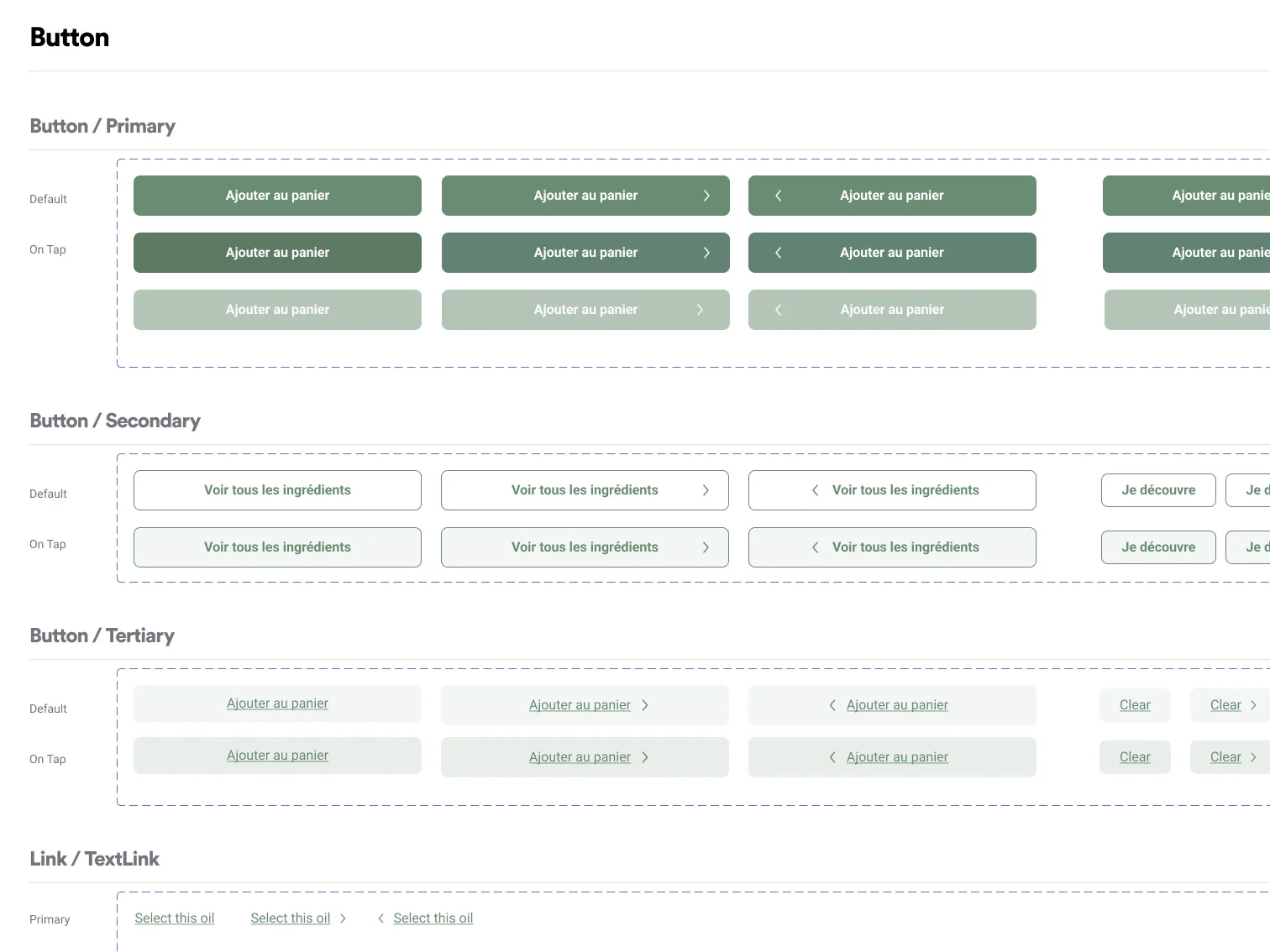
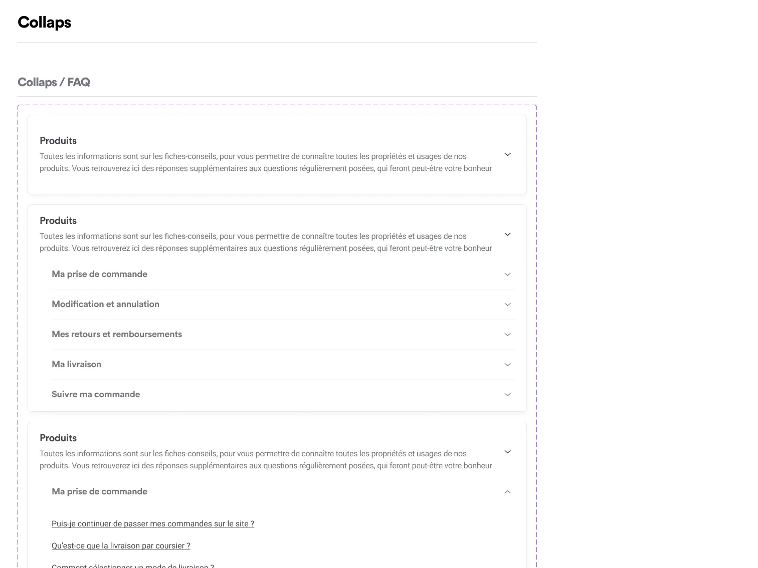
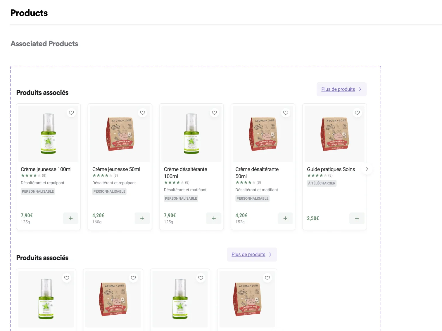
Every component is documented, with its variants and states, before it goes to the developers.
Foundations
Assets
Components
Blocks
Templates
Each level builds on the previous one. The Foundations lock in the base tokens, the Components and Blocks assemble them into functional building blocks, and the Templates cover every page type, including the awkward ones like a product page with variants or an out-of-stock page. A product team builds its page from existing blocks instead of starting blank.
A product page, in detail
Whether it's a serum or a DIY workshop, the same structure. Image gallery, badges, rating, size and color options, and an add-to-cart button that stays within reach.
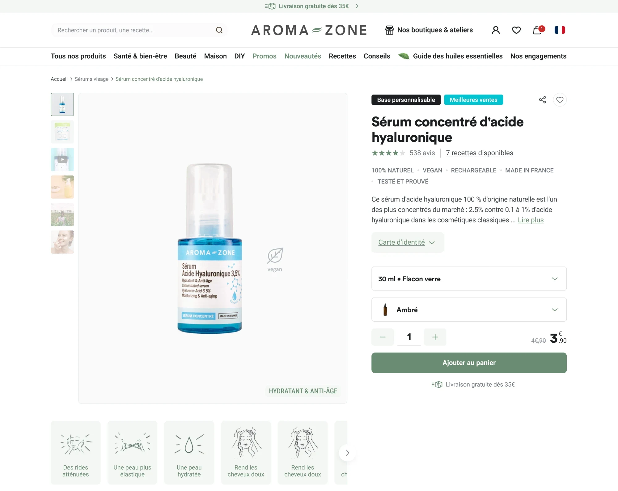
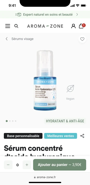
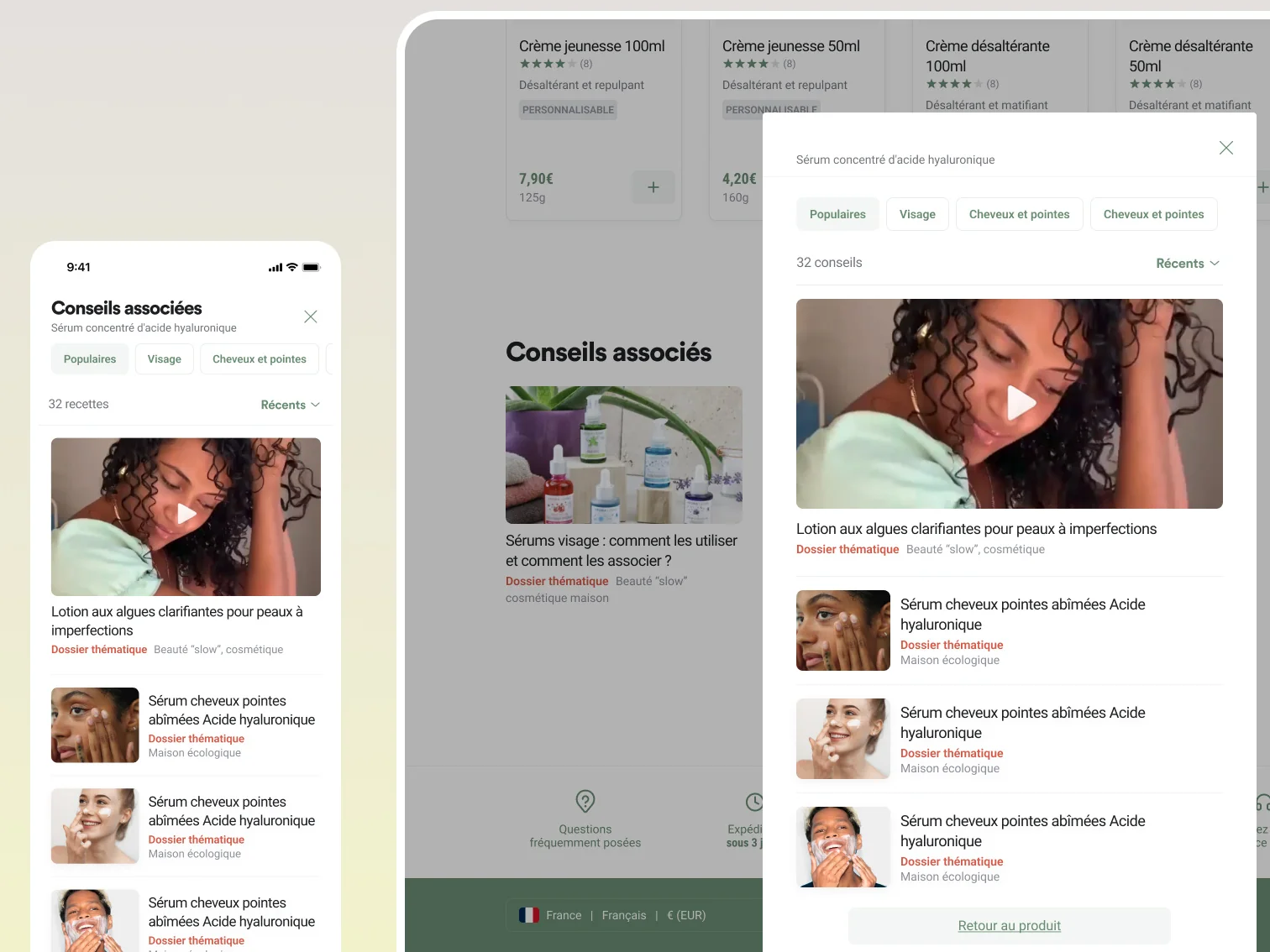
The product page doesn't stop at the sale. A "Related advice" panel points to the articles and tutorials that go with it.
The scale of the system
Customer accounts, loyalty, physical stores, articles, recipes. The design system covers the whole site, down to the last variant.
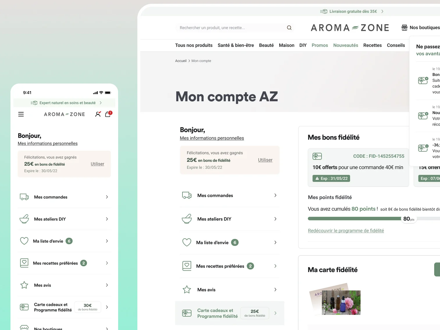
The loyalty program shows the density well. Points, vouchers, card and history, on one screen that works on desktop and mobile.
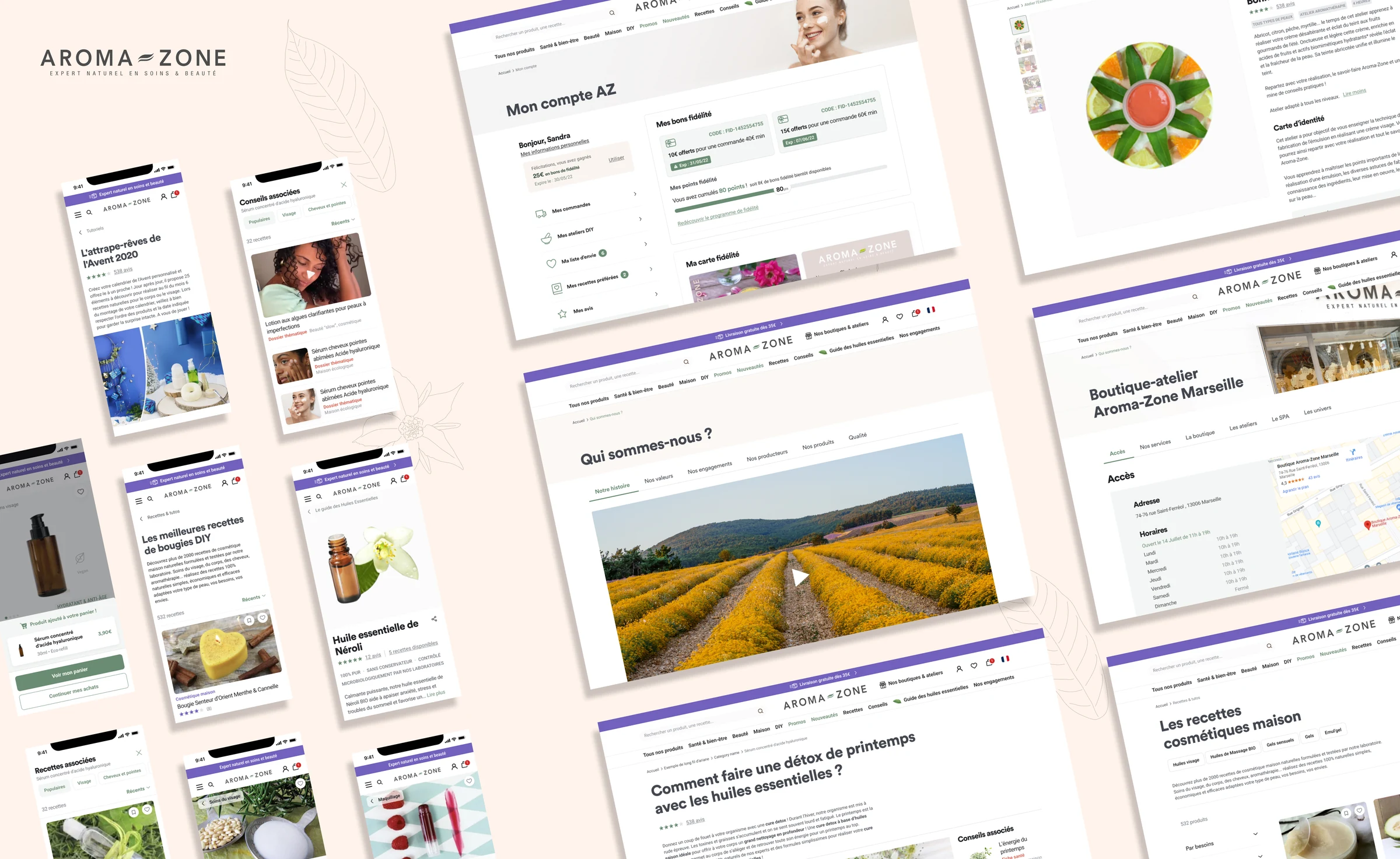
Loyalty, stores, articles, recipes. The same components dress every format, desktop and mobile.
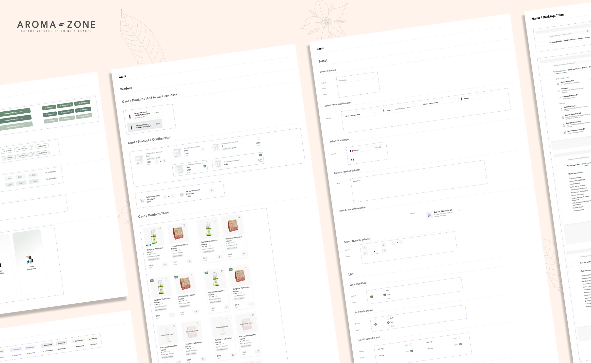
And it goes right down to the detail. Every component has its variants documented in the library, from add-to-cart to selectors and lists.
What it changed
1
A single Design System covering product pages, workshops, recipes, tutorials and brand pages.
↓
Less time spent by the team designing new pages, thanks to reusable components.
↔
The same look on desktop and mobile, across every content format.
Client review
Emilie
Review left on 08/23/2022
Great collaboration with Romain, always friendly and attentive to our needs.
Quick understanding of our requirements and results that matched our expectations.