Printemps · 2020
UI, user research and web integration for Printemps.com
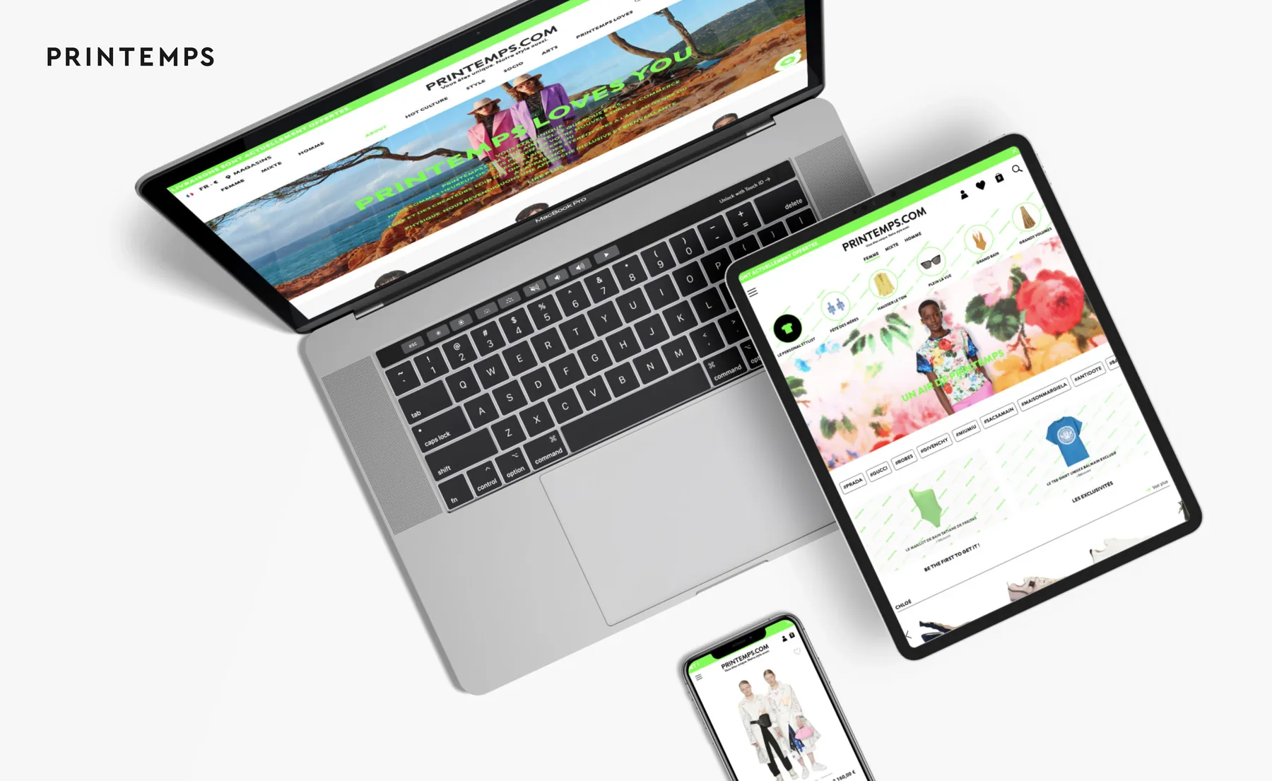
Printemps.com is the department store's site. Fashion, accessories and beauty, with a catalog of luxury designers. Alongside the e-commerce and integration teams, I worked on the UK/EN launch, user research, visual harmonization and content integration in an in-house back office.
Role
UI Designer & web integration
Scope
UI, user research, Design QA
Platforms
Desktop, tablet, mobile
Tools
In-house back office, heatmaps
The context
Day to day, I backed up the integration team so the English version shipped at the same pace as the French one. We put the site's content into an in-house back office. Text, images, static and dynamic content, commercial modules like highlights, selections and announcement banners.
User research
I also took part in the user research with the rest of the team. Together we read heatmaps on the homepage, the listing and the product page to see where people got stuck, and cross-checked that with qualitative testing.
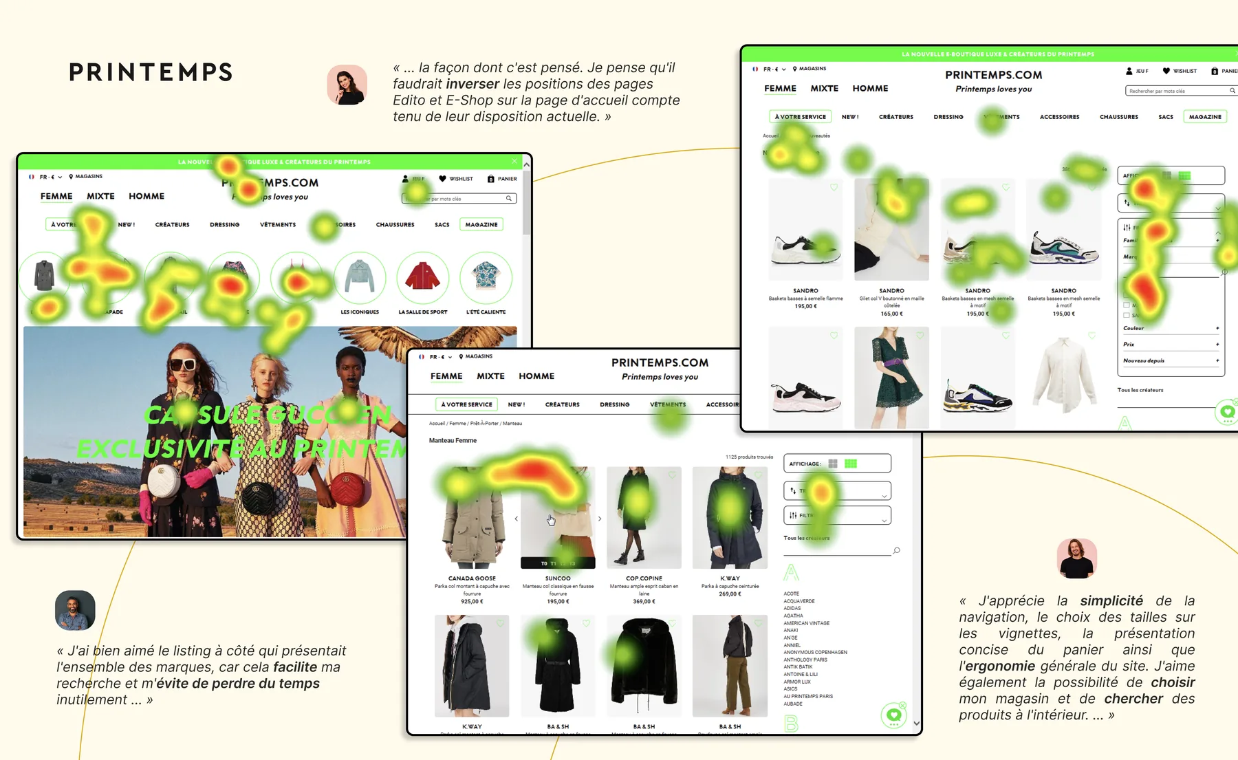
"The way it's designed. I think the positions of the Edito and E-Shop pages on the homepage should be swapped, given their current layout."
"I really liked the side listing showing all the brands, as it makes my search easier and saves me from wasting time unnecessarily."
"I appreciate the simplicity of the navigation, the size selection on the thumbnails, the concise presentation of the cart, as well as the overall usability of the site."
The "Dressing" problem
One of those threads was the "Dressing" category. Testing showed nobody got the word on first read. I put forward several ways to clear it up, at different points in the journey, and costed out each one with the integration team.
Menu · 2- or 3-column hover variants, with or without thumbnails or titles
Homepage · thumbnail block linking to a dedicated page or to themed selections
Dressing page · Total Look as-is, classic product selection, or hybrid
The merchandising teams needed room to move. Launch a last-minute dressing for Christmas, say, without booking a shoot every time.
Visual harmonization & Design QA
I also did a long pass on visual consistency. Spacing, typographic hierarchy and alignment, page by page. Header, editorial homepage, articles, footer, brand directory, category pages. I documented each discrepancy, we prioritized it with the integration team, and they fixed it.
Header & navigation
Logo size, spacing between Women / Unisex / Men, alignment of account and cart icons.
Editorial homepage
Manifesto hierarchy, news line spacing, slider arrow centering.
Article page
Title size, pull-quote treatment, links and photo credits, image corner radius.
Eshop homepage & footer
Dressing dropdown, Total Look block, exclusive products, footer reassurance elements.
Mobile app concept
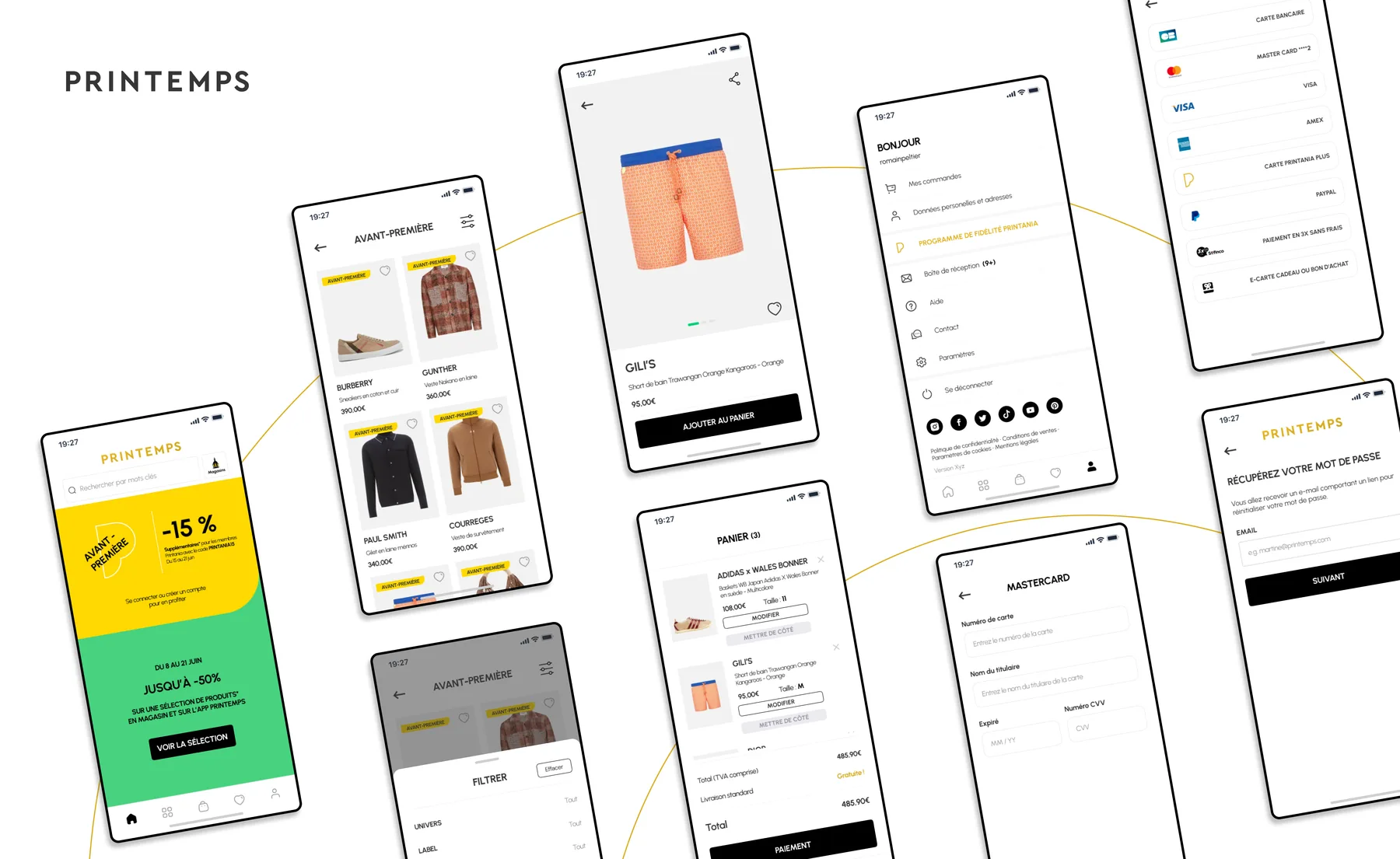
I also designed the UI/UX for a mobile app project. Product page, cart, preview, account and payment methods, password recovery. It never shipped, but it gave the team a way to explore an app-first version of the main journeys.